The WordPress Block Editor (previously referred to as the Gutenberg Editor) provides some great new options in building flexible themes. I have been building themes that rely more and more on the infrastructure provided in the Block Editor. There are several benefits to this.
I spend a lot less time building custom templates and components for each site and I find myself relying less on plugins for simple formatting/layout tasks.
There are some drawbacks too of course. The big one being that learning to build your own blocks has a pretty steep learning curve. I am working on that. Though I often find that the core blocks get me 80% of the functionality/layouts I need. Sometimes I feel like if I could just make one style tweak, the core block will suffice.
Enter the Style Filter.
You may have noticed that when you click on the transform option in the block toolbar it says “Change Block type or style”. Clicking on that brings up some style options.
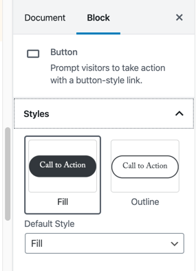
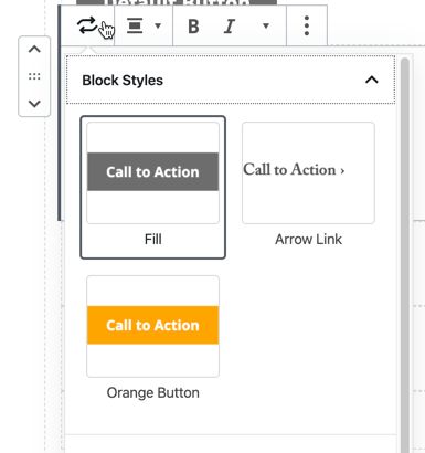
Default Block Styles for Buttons are Outline and Fill.
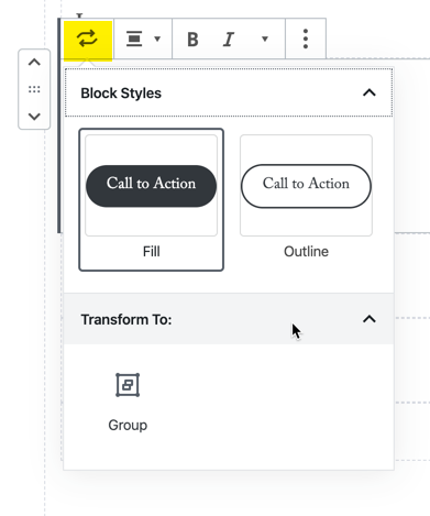
Style Options are also available from the settings pane.
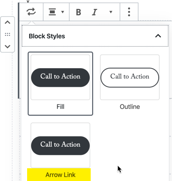
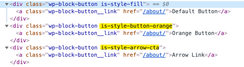
The theme I am working on has 3 custom link styles: two button styles and what I call an ‘arrow-link’.

Now I could just leave it up to the site editor to use the available tools to get links styled that way (background color, border-radius tools, additional css classes), but since we know these are commonly used styles we can provide these defaults within the editor.
In order to get the default styles, we will want to remove the outline style and add two of our own.
Adding custom block styles
You can add custom style via a php filter or javascript. We’ll cover both options. The php option is slightly easier to set up in that you can simply add the function to your functions.php file, to use javascript you will need to enqueue a js file.
Note: if you want to remove any existing styles you will most likely need to remove them via javascript. Styles that were added via javascript cannot be remove via the php filter. So if you plan on removing styles, you will need to enqueue the js file anyway and you might as well have all of your functions in one place.
PHP
In your functions.php file, add a register_block_style filter.
register_block_style(
  'core/button',
   array(
     'name'  => 'arrow-cta',
     'label' => __( 'Arrow Link', 'wp-rig' ),
  )
);- The first parameter is the name of the block you want to edit. How do I find my block name? (see below).
- The second parameter takes an array, you must provide the
- name (formatted like a slug, used to generate the css class assigned to the block)
- label (used in the interface)
Once we add that we can find our new style option in the button block. Skip below to add your styles or continue on to learn the javascript way.
Javascript
Within your theme, you will need to create a javascript file that is loaded whenever the block editor is loaded using the 'enqueue_block_editor_assets' hook.
In your functions.php file add:
function myguten_enqueue() {
  wp_enqueue_script('myguten-script',
  'assets/js/editor-functions.js',
  array( 'wp-blocks', 'wp-dom-ready', 'wp-edit-post' ),
  filemtime( 'assets/js/editor-functions.js' ));
}

add_action( 'enqueue_block_editor_assets', 'myguten_enqueue' );
Note the dependencies on ‘wp-blocks’ and ‘wp-dom-ready’.
Then in our editor-functions.js file, we wrap our functions in a wp.DomReady() function to ensure that we unregister our unwanted style after it is registered via core.
We use the wp.blocks.registerBlockStyle function and pass
- Our block name (see How do I find my block name below).
- An array consisting of the
- name (formatted like a slug, used to create the css class)
- label (used in the interface)
To unregister a style we use the wp.blocks.unregisterBlockStyle function
wp.domReady( function() {
wp.blocks.registerBlockStyle( 'core/button', {
name: 'orange-button',
label: 'Orange Button',
} );
wp.blocks.registerBlockStyle( 'core/button', {
name: 'arrow-cta',
label: 'Arrow Link',
} );
wp.blocks.unregisterBlockStyle( 'core/button', 'outline' );
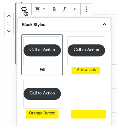
} );Once we’ve added that we can see our new styles – note that the Outline style has been removed.
Style the block
Now that we have added our styles we can add our blocks to the page. Add one of each style to the page and save it. Then you can preview the page and inspect our elements.
Now we can work on the styling. I typically create one style sheet for blocks that is loaded both on the front end and on the back end, so we can see an accurate preview of our block styles.
In our functions file, we will want to add our blocks.css file within the blocks assets enqueue hook.
function myguten_enqueue() {
  wp_enqueue_script(
    'myguten-script',
    'assets/js/myguten.js',
    array( 'wp-blocks', 'wp-dom-ready', 'wp-edit-post' ),
    filemtime( 'assets/js/myguten.js' )
  );

  wp_enqueue_style(
    'myguten-style',
    'assets/css/blocks.css',
    null,
    filemtime( 'assets/css/blocks.css' ));
}

add_action( 'enqueue_block_editor_assets', 'myguten_enqueue' );
Now we can style our elements appropriately
.wp-block-button__link {
	border-radius: 0;
	font-family: "Open Sans", sans-serif;
	background-color: #6e6d6d;
	font-weight: 700;
	transition: all 0.5s ease;
}

.wp-block-button__link:hover {
	background-color: #b6b6b6;
}

.is-style-button-orange .wp-block-button__link {
	background-color: #ffa500;
}

.is-style-arrow-cta .wp-block-button__link {
	background-color: transparent;
	font-family: "adobe-caslon-pro", serif;
	color: #6e6d6d;
	font-weight: 600;
	padding-left: 0;
}

.is-style-arrow-cta .wp-block-button__link::after {
	content: "\203A";
	padding-left: 5px;
	transition: padding 0.3s linear;
}

.is-style-arrow-cta .wp-block-button__link:hover {
	color: #b6b6b6;
}

.is-style-arrow-cta .wp-block-button__link:hover::after {
	content: "\203A";
	padding-left: 7px;
}
Now when we go to add a button, we see our custom styles styled appropriately in the editor as well as on the previewed page.
That’s it. You did it. Custom styles added to core blocks.
How do I find my block name?
If you are doing any kind of development work related to the block editor you will want to familiarize yourself with the gutenberg github repo.
The code for each block is located in gutenberg > packages > block-library > src. For the button example, we click into button > block.json and find the name there at the top: ‘core/button’.